The Role of White Space in Web Design
“There’s too much white space here; let’s add something to fill it up.”
This is, unfortunately, one of the most common phrases a designer hears from clients. There is often a natural urge to fill every corner of the viewport with information, graphics, or text. However, emptiness in design isn’t wasted space—it’s a critical functional element. I’m not advocating for vast, empty wastelands, but rather for a strategic use of breathing room that serves a specific purpose in your layout.
White space is an active element of design. Don’t treat it as a passive background.
Let’s examine a few popular websites and analyze how they effectively utilize white space.
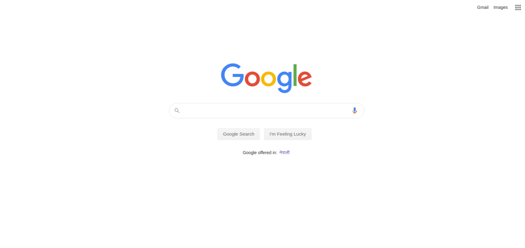
1. Google
Google is the master of focus. White space is used here to make the primary action—searching—immediately obvious and distraction-free. By stripping away clutter, the user’s eye is drawn exactly where Google wants it to go.
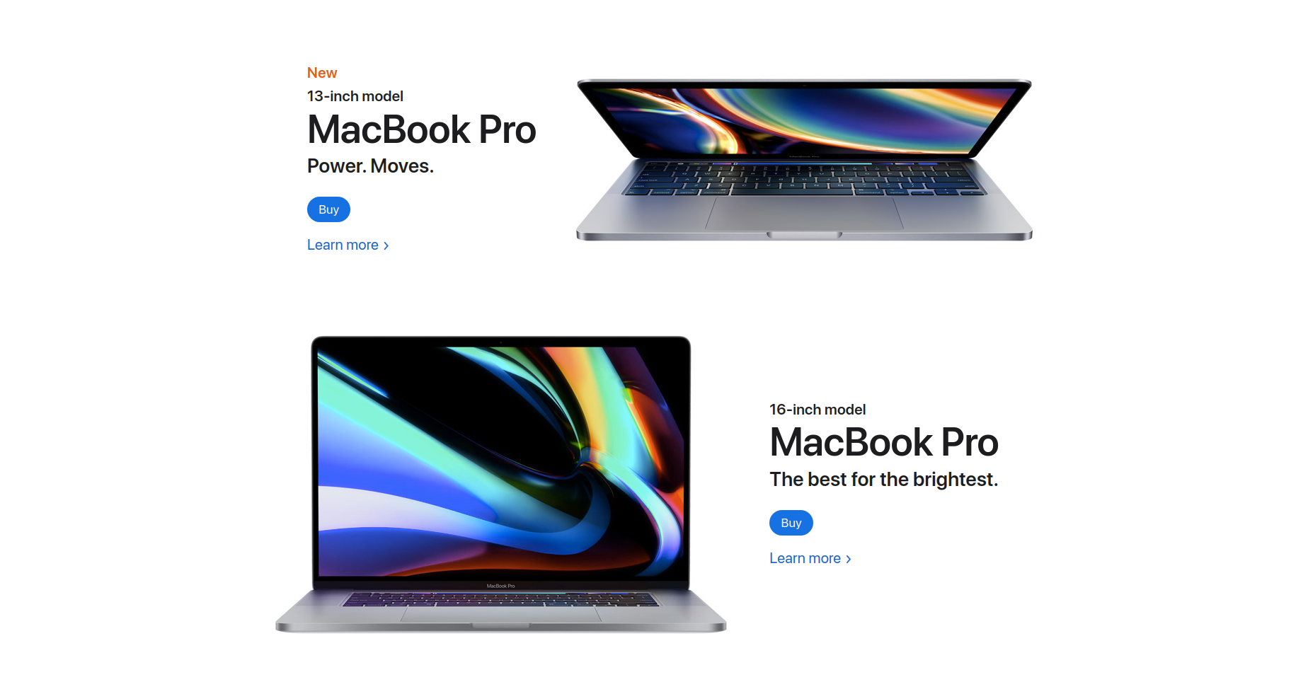
2. Apple
Apple uses white space to convey luxury and focus attention entirely on the product. The generous spacing creates a gallery-like feel that elevates the perception of the hardware. The lack of visual noise tells a story of simplicity and elegance.
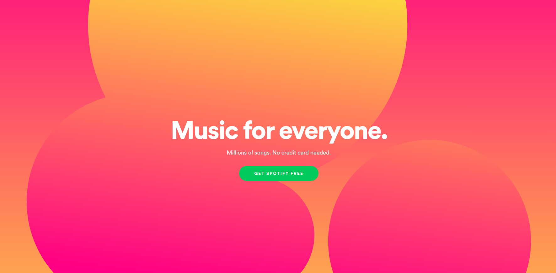
3. Spotify
It’s important to remember that “white space” is a technical term for negative space—it doesn’t have to be white! Spotify uses a dark aesthetic, but the principles remain the same. The negative space allows the colorful album art and typography to pop, creating a vibrant, immersive experience.
Conclusion
When working on your next layout, treat white space as an active ingredient in your composition, just like images or type. Always ask yourself these questions:
- Is there enough breathing room in my design?
- What role does this specific space play? Does it separate, highlight, or group elements?